Imagine that we are creating a travel agency app and have to render a list of beautiful countries the agency is organizing trips to. Each item in the list should display a name of the country and an expand icon.
When the user of our app clicks on the list item, the expand icon should rotate 180 degrees, and under the country title should appear a paragraph with the description of the corresponding country, like this:

In other words, we want to render an accordion menu that consists of multiple elements with collapsible content.
There are many ways to implement an accordion. I chose to do it with React and TypeScript. I'm also using two component libraries — Styled Components for styles and React Spring for animations.
Let's first talk about the tech stack used in this app.
Why choose React?
I've been using React.js for a while now, and I really enjoy building stuff with it. I love its functional nature, flexibility, easy to compose and scale component-based modular architecture, JSX syntax, high performance out of the box, variety of optimization techniques, and its rich ecosystem of useful tools and libraries, like Styled Components and React Spring, I used building this app.
According to various surveys, React is one of the most popular and in-demand front-end technologies for several years in a row now. It is constantly evolving and has an impressive and friendly community of great devs! ✨
Why use TypeScript with React?
To be honest, prior to 2023, I was reluctant to add this extra layer of type checking to my projects because I didn't want my beautiful and concise code written in JavaScript to turn into some kind of verbose Java, and I didn't think, it could give me any benefits at all. It looked like all the hype about TypeScript is coming primarily from the OOP world, while JavaScript and modern React are more about functional programming.
At the beginning of 2023, I watched on YouTube an engaging interview with Guido van Rossum, the creator of Python, and among other questions he was actually asked if he would recommend using JavaScript or TypeScript. The answer was TypeScript. He said that it's an enormously helpful extra tool that helps you keep your head straight about what your code is actually doing. It helps you with editing your code and ensuring it is not too incorrect.
I thought, hmmm...
So, I decided to give it a try and started experimenting with TypeScript. And the more I used it, the more I saw the point. Long story short, today TypeScript is my personal preference, and I would recommend to any JavaScript developer to give it a try, if they haven't done so yet 😉
Why style React Components with Styled Components?
I am ok with other ways of managing styles in React apps, but I do like the benefits of doing it with the help of styled-components library 😊
Styled Components is a runtime styling solution, that generates unique class names and injects styles into the DOM dynamically. The class names are generated and our styles are added to the DOM only when the component is rendered, so we don't have to worry about tons of unused CSS or class names colliding, which is a common source of frustration, when using global CSS stylesheets, and that's awesome!
This CSS-in-JS approach (CSS is defined in JavaScript files) enables you to colocate your styled component to the actual React component in the same file, if the size of the file isn't large, or in another file in the same folder otherwise.
To define your styled component, you need to import the styled internal function from this library. The styled function is also an object, — yes, it's possible in the world of JavaScript 😀 — and it lets you call on it a helper method with the same name as HTML element you want to style, pass to this method CSS rules inside tagged template literals, and assign the result of this composition to a variable with a meaningful name.
When writing CSS rules, you have also an option to add styles dynamically based on React props passing an interpolation function to your styled component's template literal.
For example, look at this simple Footer React component from my project:
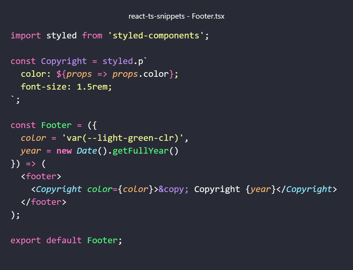
Here we created a styled component named Copyright, declared that we want to render it as the <p> HTML element, and attached to it a couple of CSS properties: dynamic color and static font-size. If we decide to change these styles later, we can modify them then and there, in the same file.
The Copyright styled component can be used as any other React component with an extra benefit of having styles, attached to it! Here we use it in the same file, rendering it in the Footer React component and assigning its color property a default value that we can easily change later. Now we can export and use the Footer component, already containing HTML, CSS and JavaScript, anywhere in the app, which is great, isn't it? 😎
Why use React Spring animations?
The majority of users would probably agree that the most engaging animations are smooth, fluid and natural, and the animations from React Spring library, based on spring physics, give you exactly that feel ✨
Instead of using traditional for CSS time-based animations, react-spring is based on physical properties like velocity, mass, friction and tension. If your animations rely on physics rather than time, all movements on the screen have that natural and smooth feel that we love.
Another benefit of using React Spring animated components with styled components is that we can compose them, and I'll show you, how we can implement it.
So, let's start creating our mini-app!
Travel Agency app
Our main component is TravelAgency:
Travel Agency Component

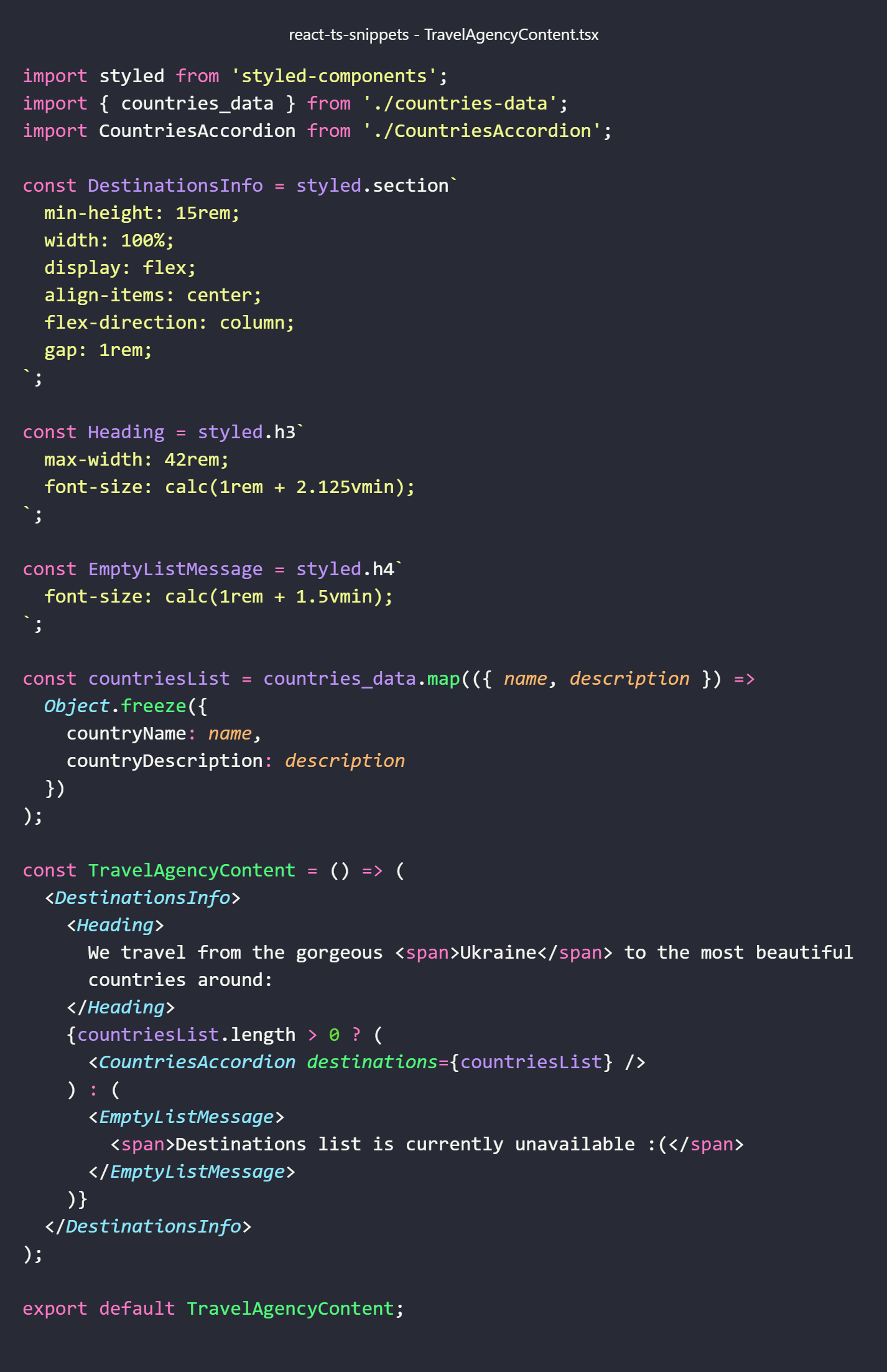
The TravelAgency component renders the main page content surrounded by the header and the footer. The content consists of the information about countries available for trips in our travel agency.
Travel Agency Content Component
This is where Styled Components come into play in our app!
Creating Styled Components
Let's reiterate: in order to create our own styled components we import the styled object from the styled-components library. This object comes with a bunch of helper methods that have the same names as the HTML elements we want to style: h1, h2, section, footer, etc. Then, we pass CSS rules, enclosed in backticks, to a helper method on the styled object to attach styles to the styled component we created.
These helper methods on styled object are actually component factories, so we can assign a whole expression to a variable. The value stored in this variable is a reference to a newly created React component.
This way, we created three components: DestinationsInfo with styled.section`...`, Heading with styled.h3`...`, and EmptyListMessage with styled.h4`...` with the corresponding CSS declarations in backticks.
When we render these components nested inside TravelAgencyContent component, they will produce <section>, <h3> and <h4> DOM nodes, and the styles we've written for them will be injected into the page.
Note that we defined our styled components outside of the React component that renders them because we don't want them to be recreated on every (re-)render and make our app slower.
Rendering content conditionally
The data for our list of countries is stored in a separate file, respecting the separation of concerns principle. We import it in the TravelAgencyContent component and map it to an array of immutable country objects, each of which has country name and description properties. We pass this list of countries to the destinations prop of the CountriesAccordion component, responsible for rendering the accordion menu.
Using the power of ternary operator and conditional rendering, we check the length of the list of countries, and the TravelAgencyContent component renders the CountriesAccordion component, if the length is greater than 0, or the EmptyListMessage styled component in case our list of countries has no items for some reason.
Now, let's move to the CountriesAccordion component rendered by the TravelAgencyContent component:
Countries Accordion Component

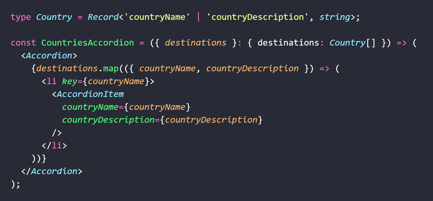
Here again we start with creating a styled component by assigning the result of styled.ul`...` expression to the Accordion constant. When the Accordion component is rendered in the browser, it will produce the <ul> DOM node. But notice that this time, inside tagged template literals, we are defining CSS rules not just for the component itself, but also for its children, and we do so using another cool feature, known as nesting.
Nesting styles with Styled Components
If you've worked with preprocessors like Sass, you are familiar with the concept of nesting (as of 2023, this feature is finally supported natively in CSS in all major browsers!). Sass lets you nest CSS selectors in the same way as HTML. Similarly, if you put nested selectors inside your styled component's tagged template literals, they will refer to children of the component. This way, the Accordion styled component contains CSS rules for the unordered list itself and nests the styles for its child, the <li> element tag.
Yes, we can create a separate styled component for our list item or any other element, but nesting child selectors inside the root element makes our code more structured, cleaner and easier to read.
And now TypeScript comes in to help us with structuring the code further.
Declaring types for Countries Accordion Component props
As I've mentioned above, TypeScript is more than just about static typing that helps us make our code less prone to bugs. Its arguably most useful feature is enabling us to define a clear code structure with explicit type annotations, making it easier for developers to read, modify, scale and maintain the codebase, especially, when it grows in size and complexity.
When using TypeScript in React apps, however, you should not overuse typing because in most cases TypeScript knows to infer the most specific type possible. That said, you have to always declare a type for your component props.
The CountriesAccordion component receives the destinations prop value from its parent component (TravelAgencyContent). Let's see, how we can define its type.
Methods of typing React props with TypeScript
Props can be declared inline using an object literal. You'll often see it done with destructuring syntax. I used this method declaring the destinations prop type:
If your props type signature is as simple as in the code snippet above, it is fine to type your props inline.
When your props type is more complex, a better option would be extracting it into a type alias or an interface, like this:
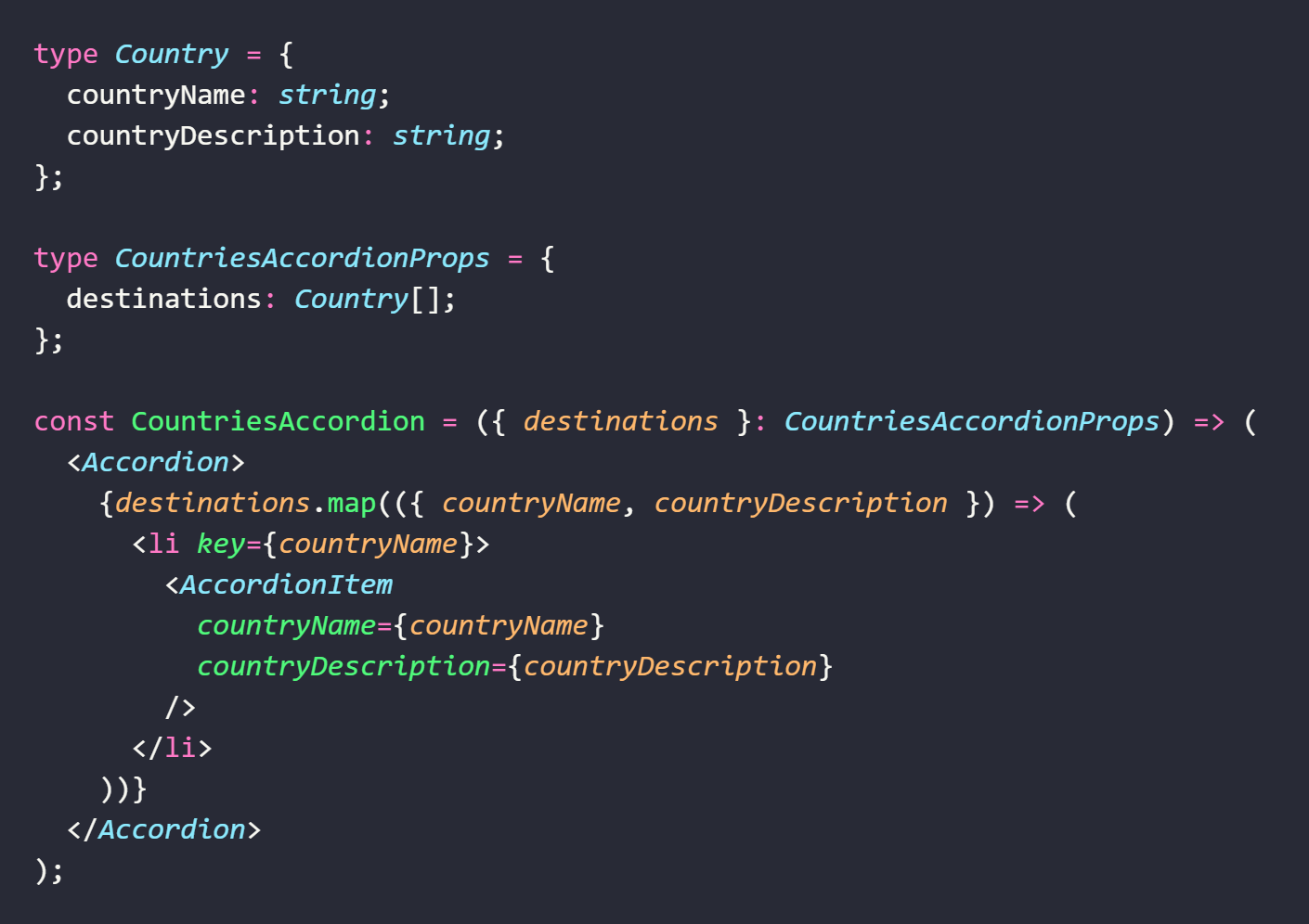
The latter method is more verbose and looks different, but it's doing exactly the same. Here for defining the CountriesAccordion component type props we create a type alias named CountriesAccordionProps following the props naming convention:
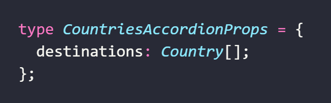
We declare that the destinations value must be an array of countries, each of which is an object with two properties: countryName and countryDescription, both of type string.
I defined the Country type separately, using Record<Keys, Type> utility type. You'll often see it in React apps used to declare an object type with specified keys and values:

If you are not yet familiar or comfortable with TypeScript utility types, you can use the following type alias instead — its signature is self-explanatory:
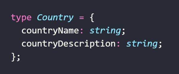
We could also nest the country object type inside CountriesAccordionProps type, but abstracting its definition into a separate type alias makes our type definitions easier to read and enables us to export and use Country type in other files that might need it.
Another useful option to consider is the possibility of extracting definitions for your types and/or styled components into a separate file. For the relatively small CountriesAccordion component, I preferred the colocation approach, but for the bigger one, I would use a more modular code structure with namespaces.
Even if TypeScript is (still) not your cup of tea, you may notice that there is not that much of typing when using TypeScript in a React app, just a small amount of it that helps you see right away what the actual chunk of code is about.
And now let's have a closer look at our Accordion styled component rendered by the CountriesAccordion component:
Decomposing Accordion Component
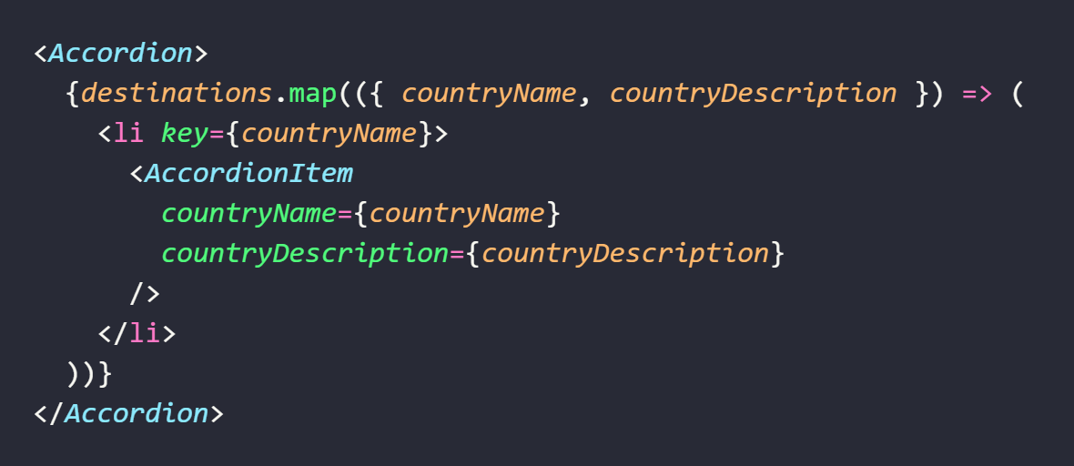
Accordion component wraps accordion menu items created from our list of destinations. With the help of JavaScript Array map method, we transform our array of countries into an array of AccordionItem components nested inside the Accordion component.
We pluck countryName and countryDescription properties from the CountriesAccordion component's destinations prop using destructuring, and pass them to the AccordionItem component via props. We also give each item in the list a key prop set to a unique value of the country name, so that React knows how to display our countries in a correct order.
I chose to abstract the accordion item into a separate component because there's a lot of boilerplate code for styling it 😅 Accordion item has also its own state, and passing state down whenever possible is a good practice because it reduces the amount of re-renders of the parent component and makes the code structure cleaner.
Hooray! We've reached the most delicious 😋 part — accordion animations ✨✨✨
Accordion Item Component
Composing animated Styled Components
We've talked earlier about how to create a styled component. What about creating an animated styled component? Is that possible? Yes, absolutely! We can create it using one of the niftiest techniques from the world of functional programming in general and React in particular — function composition.
styled.div vs styled(animated.div)
For example, to create a styled component that will produce a <div> HTML element we used the following signature: styled.div`...`.
To create a styled component that will render an animated <div> we wrap our div in animated higher-order component from the react-spring web target and pass it to the styled factory function as an argument, like this: styled(animated.div)`...`.
styled.div`...` and styled(animated.div)`...` are both styled components that will be rendered as a <div> element in the browser. Both of them will have encapsulated styles declared inside tagged template literals. The difference between them is that to the div wrapped in animated component we can also attach our cool react-spring animations — you'll see how we can do it in a moment.
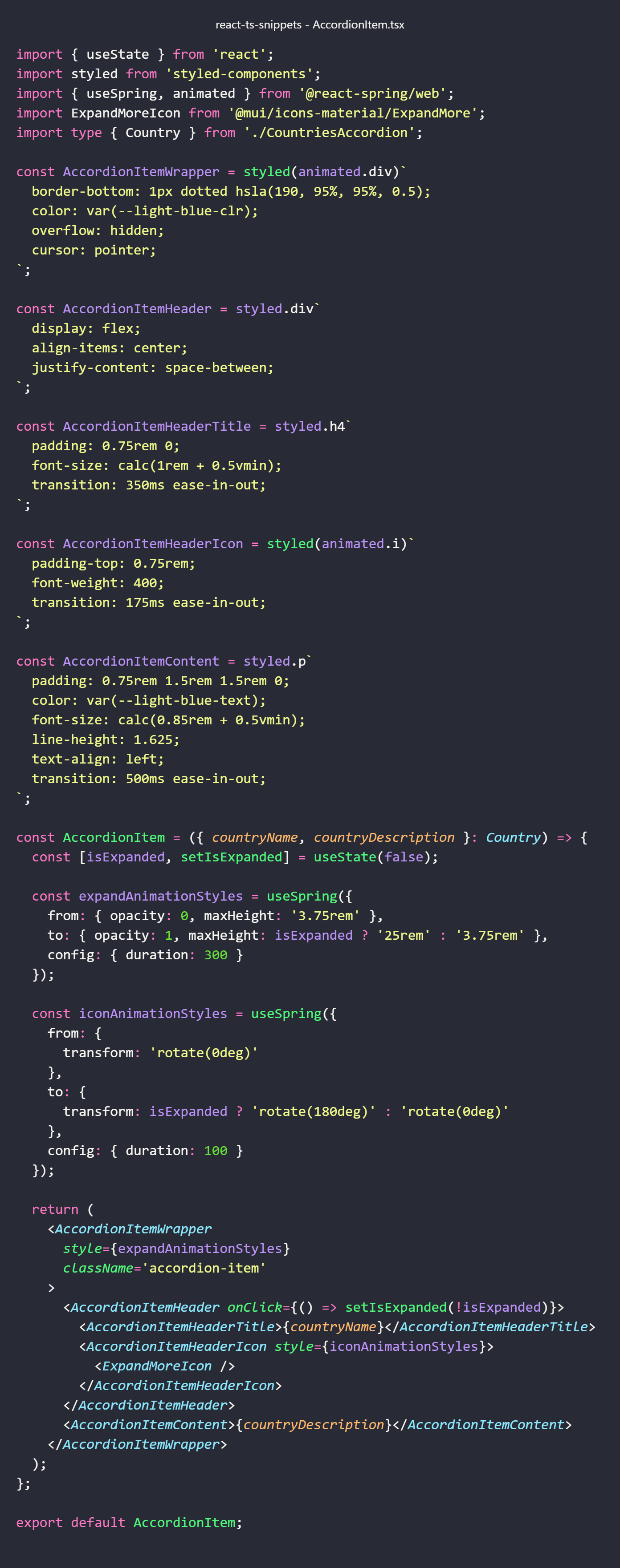
Creating Accordion Item Component with Styled Components and React Spring animations
As you've seen in the code snippet above, our AccordionItem component renders three regular styled components: AccordionItemHeader, AccordionItemHeaderTitle and AccordionItemContent, and it also renders two animated styled components: AccordionItemWrapper and AccordionItemHeaderIcon.
Now the AccordionItem component composes all its nested (styled and animated) components. It also has the isExpanded state with an initial value of false that will be toggled each time the user of our app clicks the <div> element produced by AccordionItemHeader styled component to which we added the onClick event prop and set its value to the inline handler function.
When our user clicks one of the accordion items (country names), and its isExpanded state value changes, the element rendered by the corresponding AccordionItemWrapper component should expand and show the country description or collapse and hide it, and the icon rendered by the nested AccordionItemHeaderIcon should rotate. As we want to deliver the best UX possible, we'll sprinkle this functionality with nice react-spring animations ✨
Configuring spring animations with useSpring Hook
So, let's create two animations — one for expanding and collapsing the accordion item and the other for rotating the icon. useSpring flagship Hook from React Spring library that enables us to configure animation styles will help us with their implementation.
According to React Spring docs, "useSpring doesn't actually animate anything though. It just returns SpringValues that we pass to our animated component... These springs are passed to the animated component".
To get these spring values we call useSpring just like any React Hook and pass to it the configuration object as an argument. We store the returned values in the corresponding expandAnimationStyles and iconAnimationStyles variables:
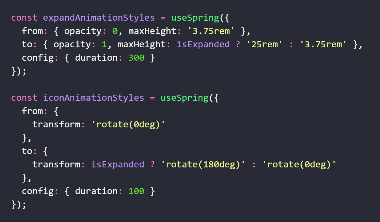
With the keywords 'from' and 'to' we define the start and end values of our animation, and we use 'config' keyword for additional configuration values.
Configuring expand animation
So, for setting up the expand animation, we're starting with an opacity value of 0 and a maximum height of 3.75rem and ending with an opacity value of 1 and increasing the max height of the accordion item to 25rem when the isExpanded state value is equal to true, and resetting it to 3.75rem when it is equal to false. The opacity animation creates a nice fade-in effect when the page loads. In the config object we set the duration of expand animation to 300ms.
Configuring icon animation
For configuring the icon animation, we're starting with a transform rotate value set to 0deg and changing its value to 180deg to rotate the icon when the isExpanded state value is equal to true. We reset rotation value back to 0deg when the state is equal to false. The duration of icon animation is set to 100ms.
And lastly, we have to set the spring values created with useSpring Hook to the style property of the corresponding components: expandAnimationStyles to AccordionItemWrapper and iconAnimationStyles to AccordionItemHeaderIcon.
Our nice little animated accordion is ready ✨✨✨
We could add various cool features to our travel agency app like forever, but for now let's stop here 😅
I hope you've enjoyed reading this article and have learned something new and interesting 😊🙃